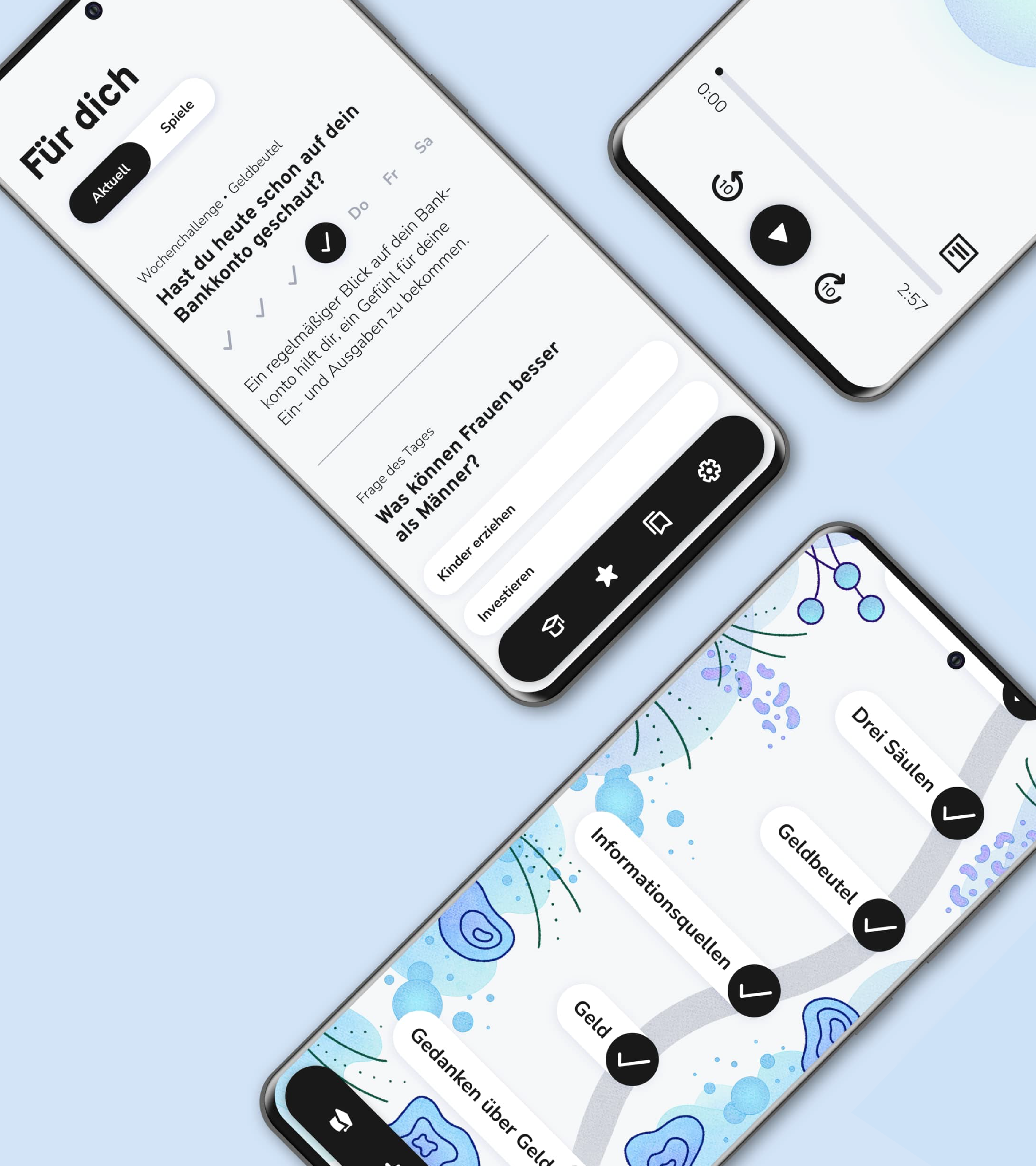
Title: Learning app for women - Supporting women's financial independence
Team: Alicia Hardegen, Bianca Tillmann
Goals: To create a learning app that motivates and inspires women to become more financially independent
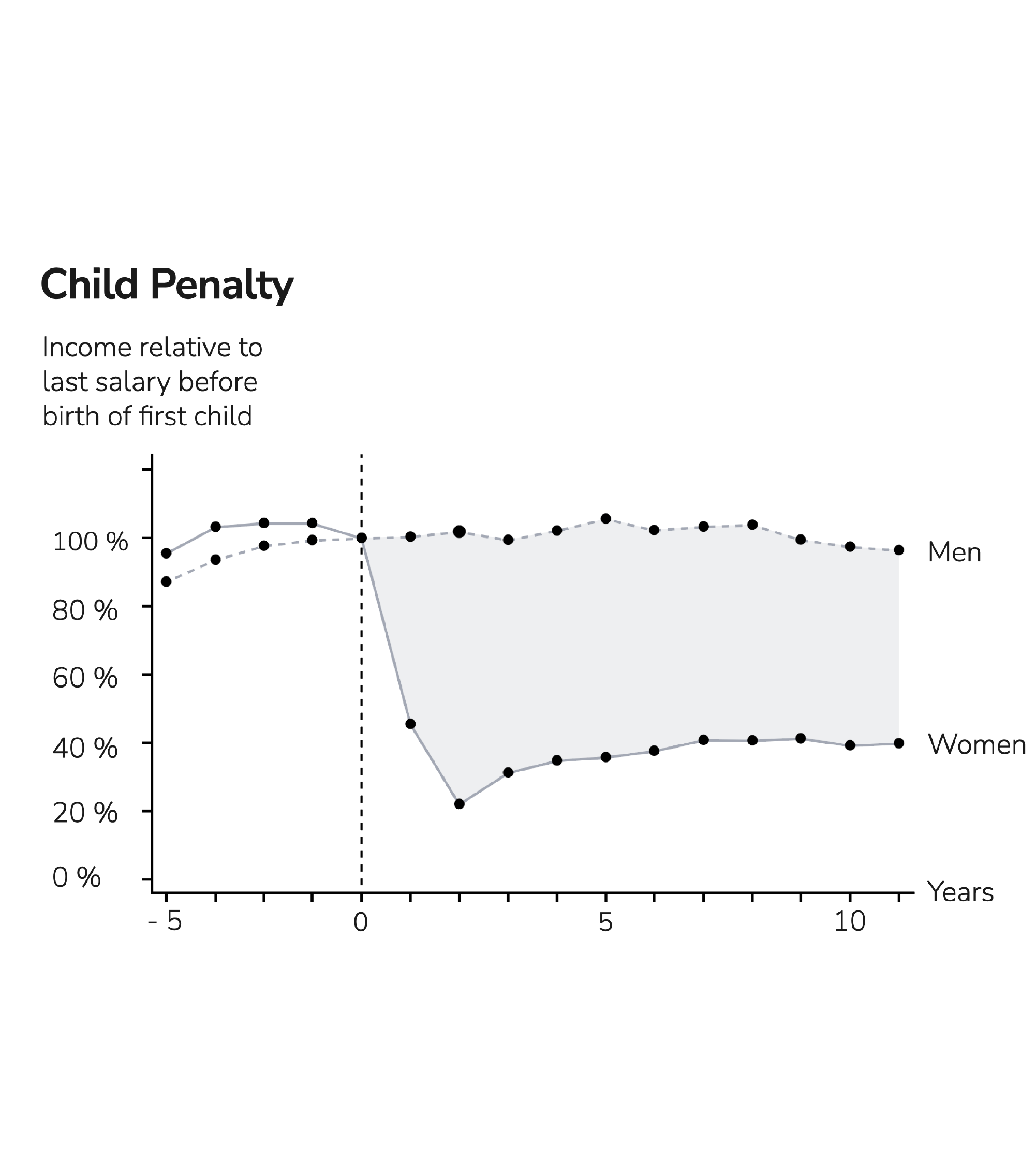
In Germany, women earn less, invest less and have less pensions than men. As a result, women are much more at risk of poverty in retirement. Often, they are financially dependent on their partner or the state. The problem is increased by the fact that women have higher deficits in financial literacy. As a solution, we started to create a concept for a learning application aimed at women between the ages of 25 and 35.
Picture source: https://voxeu.org/article/child-penalties-across-countries-evidence-and-explanations
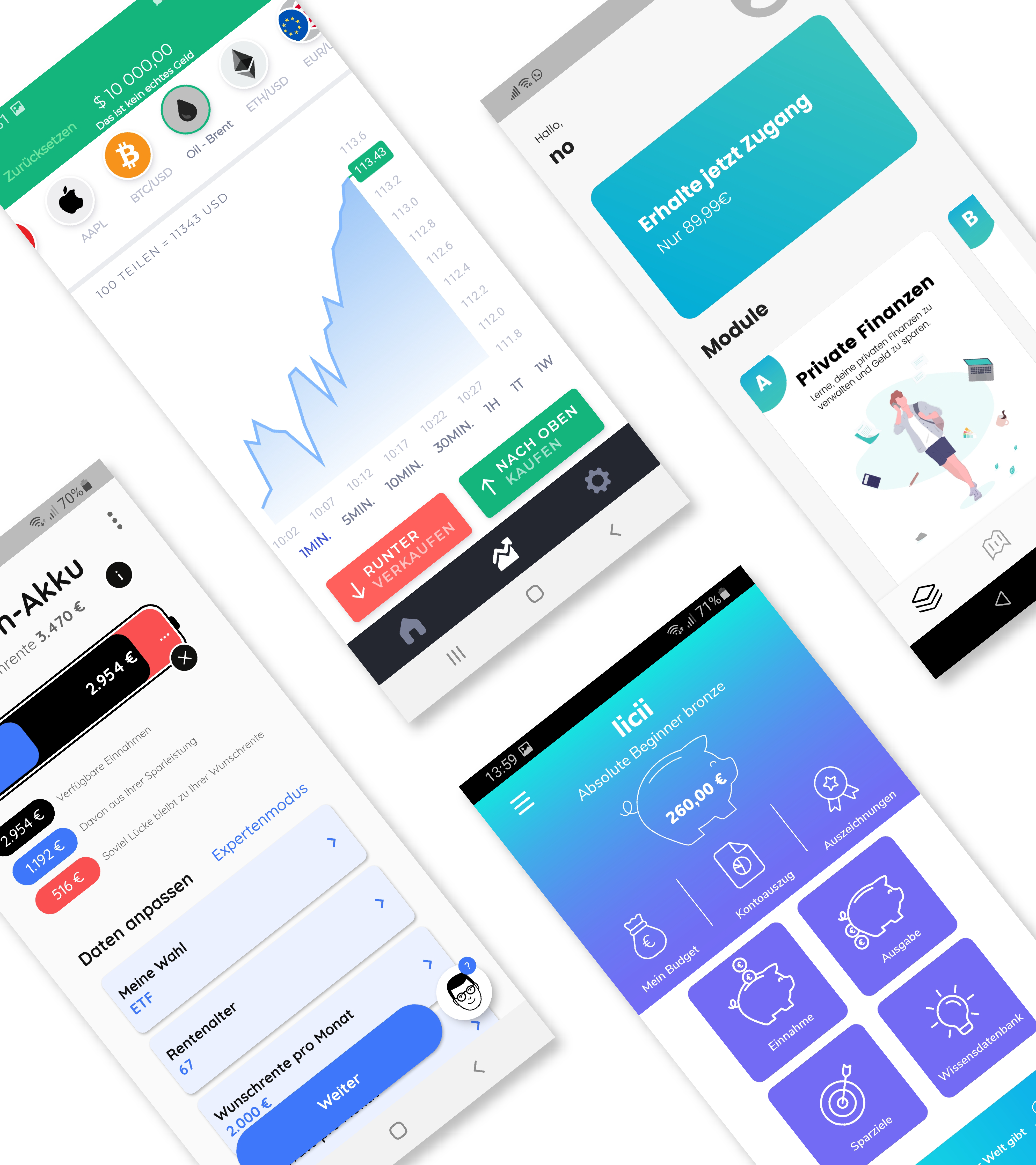
With the help of various methods (expert and user interviews, talks, webinars, a retirement advisory service, a literature research and two market analyses on learning and finance apps), we analyzed problems, generated initial ideas and formulated requirements.
Screenshots of the apps Vinz, Investmate, Fibi and Budgetplus
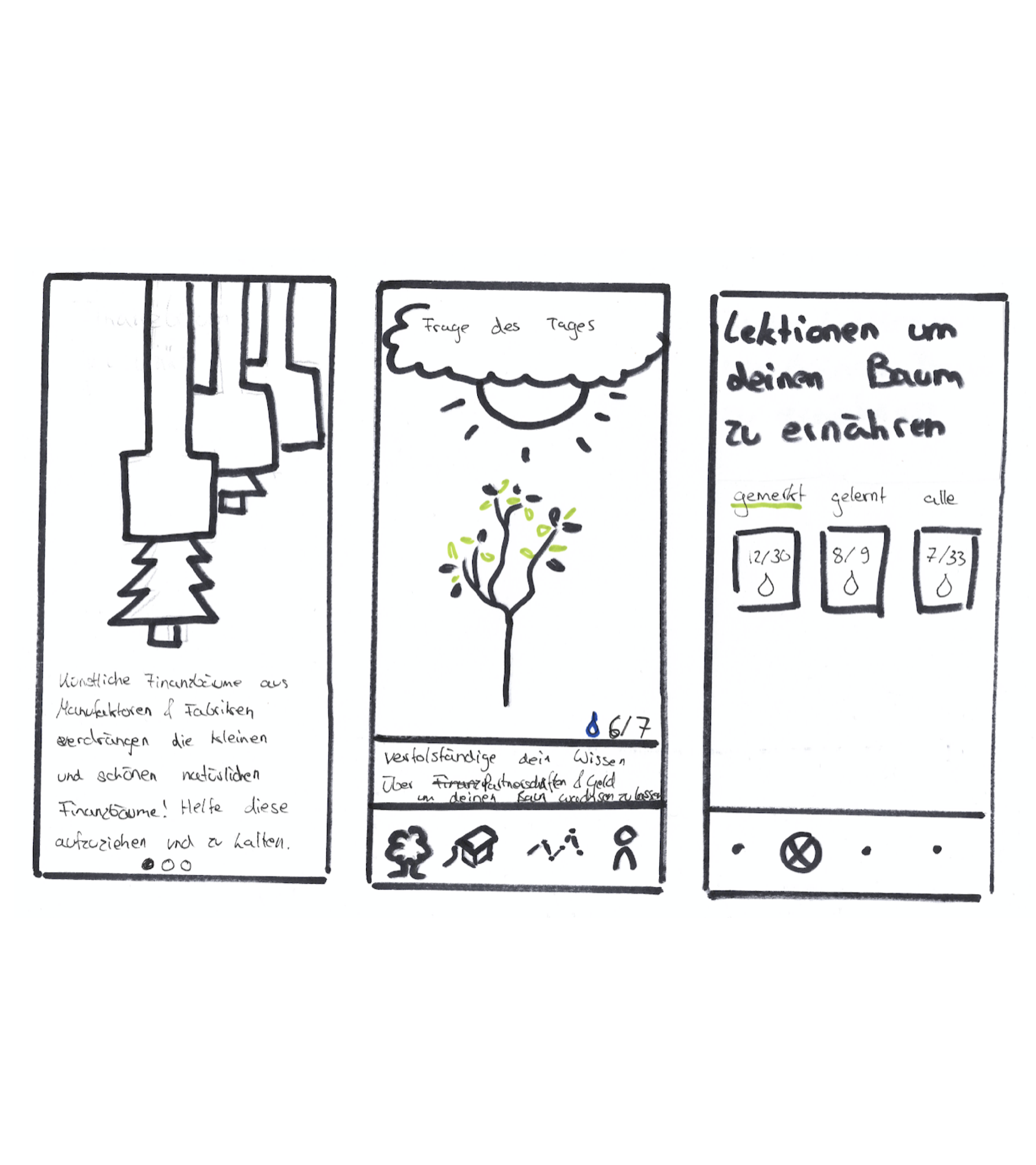
In order to quickly initiate the conception phase, generating new ideas, a design sprint was carried out. This involved formulating goals, risks and HMW (How might we) questions. Lightning demos were presented and various solution approaches were designed using Four Step Sketch. Finally, a first prototype was created and tested.
There were several different approaches how to solve the key problems. We decided to use a learning app as solution, because we saw the greatest potential here. We refrained from linking the application to service providers and products, as this could have jeopardized its integrity and could have patronized our users.
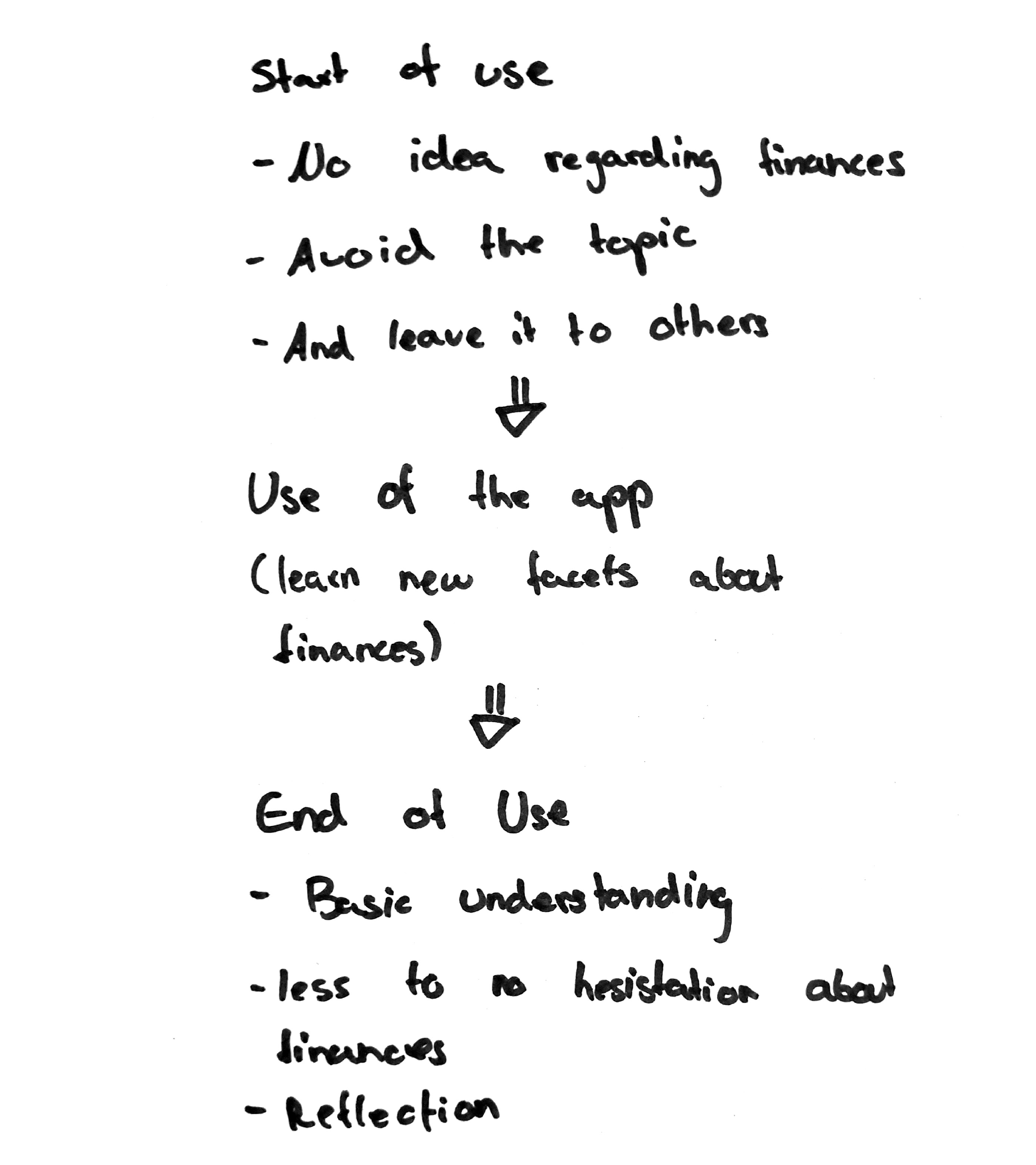
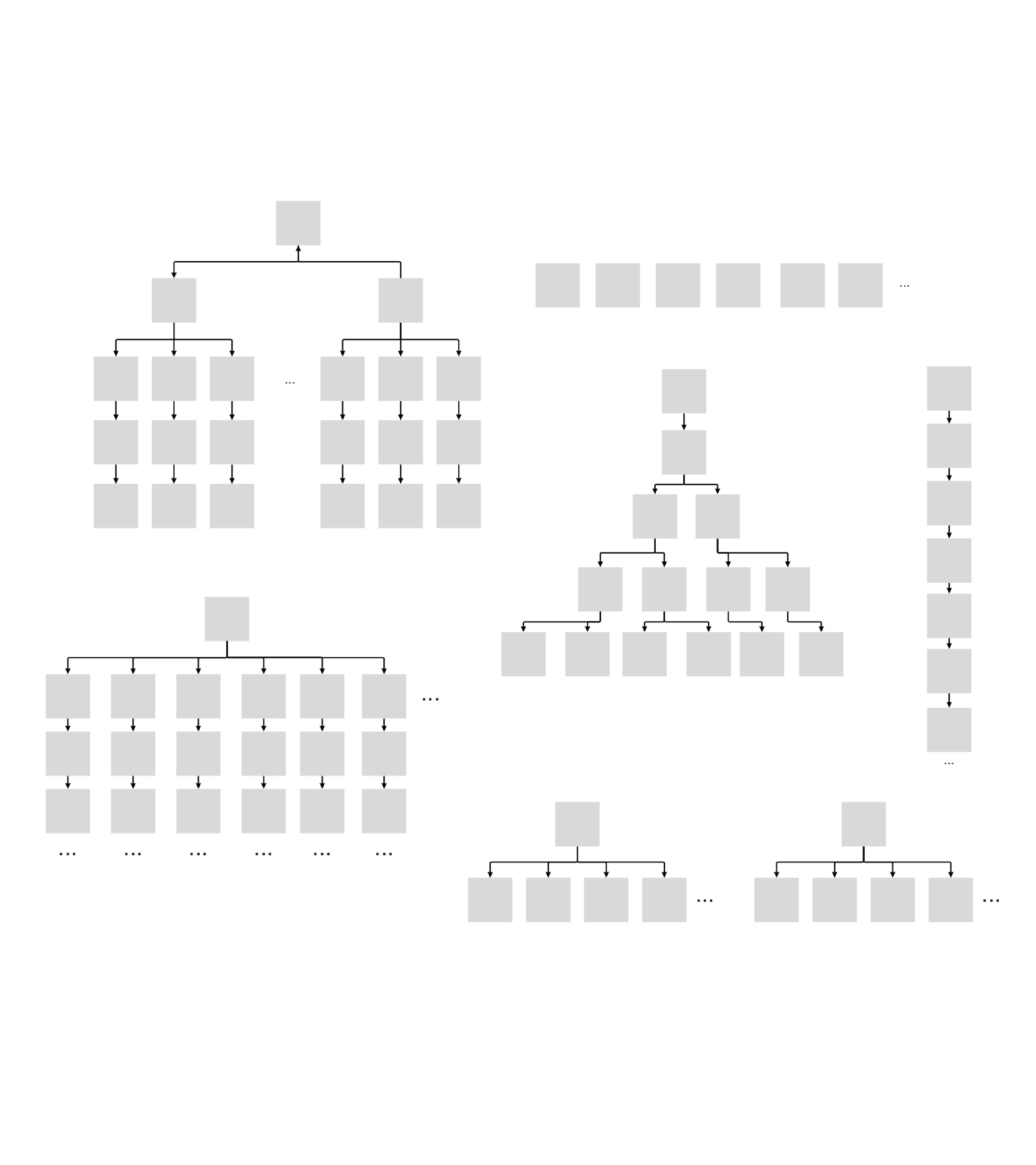
Once it had been decided that a learning app for finance would be designed, the order in which lessons could be selected and the allowed degree of freedom were considered. The decision was made in favour of a largely linear path, as this is particularly straightforward and would encourage users to acquire basic knowledge from a wide range of subtopics.

With the structure of the learning path, an information architecture of the remaining functions and wireframes were created. Simultaneously, the design was developed. Subsequently, various aspects were tested in user tests.
Finance has an image problem. Interviews revealed that negative feelings are often attached to the topic. Another issue was that associations such as the piggy bank, stock prices or budget planners did not fit the user group. An opportunity was seen in the structure of the learning path. This could make the learning successes visible through changes, using the design as gamification. Various ideas were developed for this purpose.

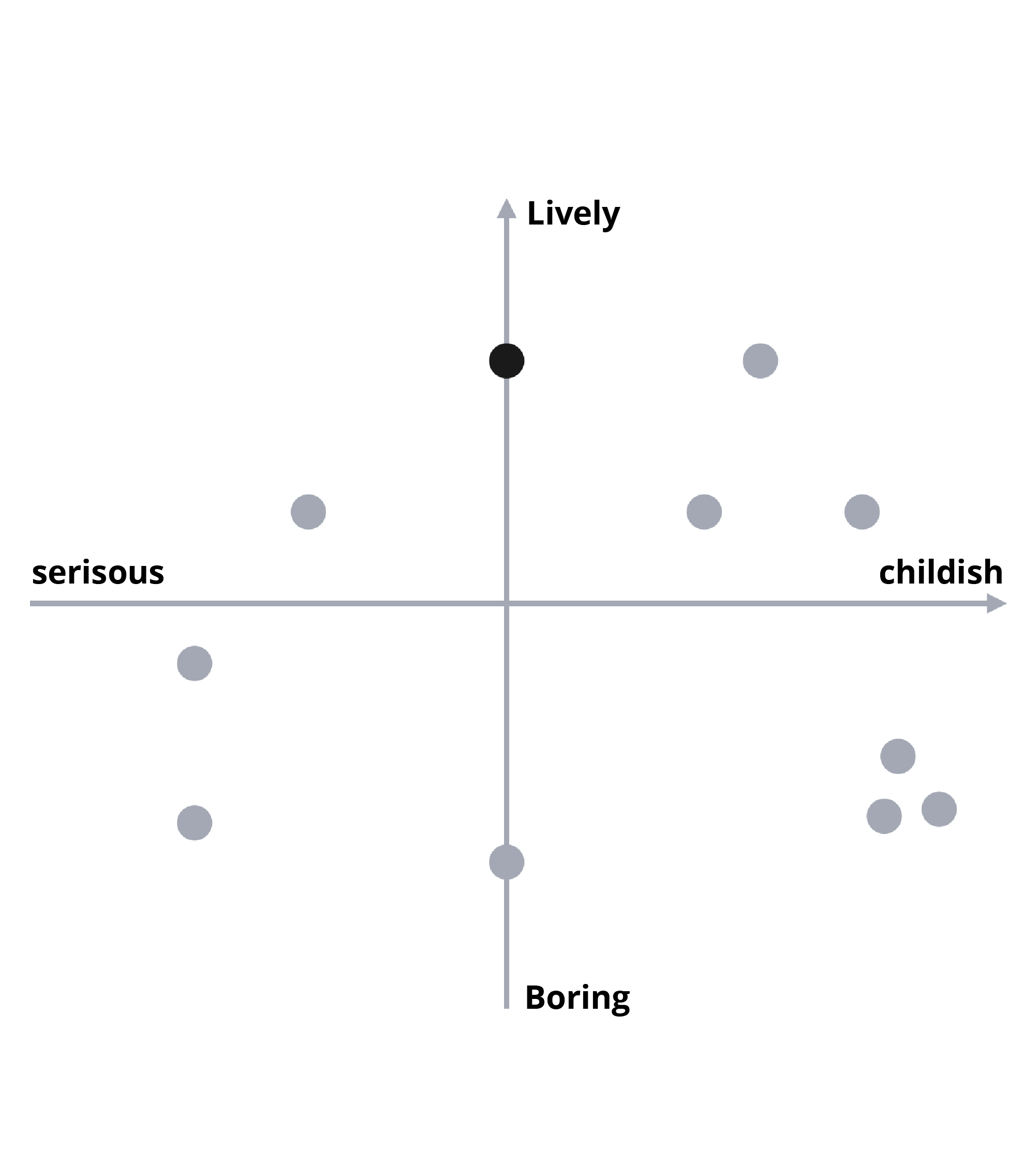
In order to decide which idea fitted best, it was considered what the application should not be like. For example, it should not look too childish or girly. At the same time, it should not look too serious either. In order to select a design a matrix was developed.
The decision was made in favour of the Abstract Life concept. When chapters are completed, new elements are added to enhance the learning path. To make the path more lively and to spark curiosity, each lesson has its own element and specific colour. The path has a watercolor texture to stand out from the UI elements.

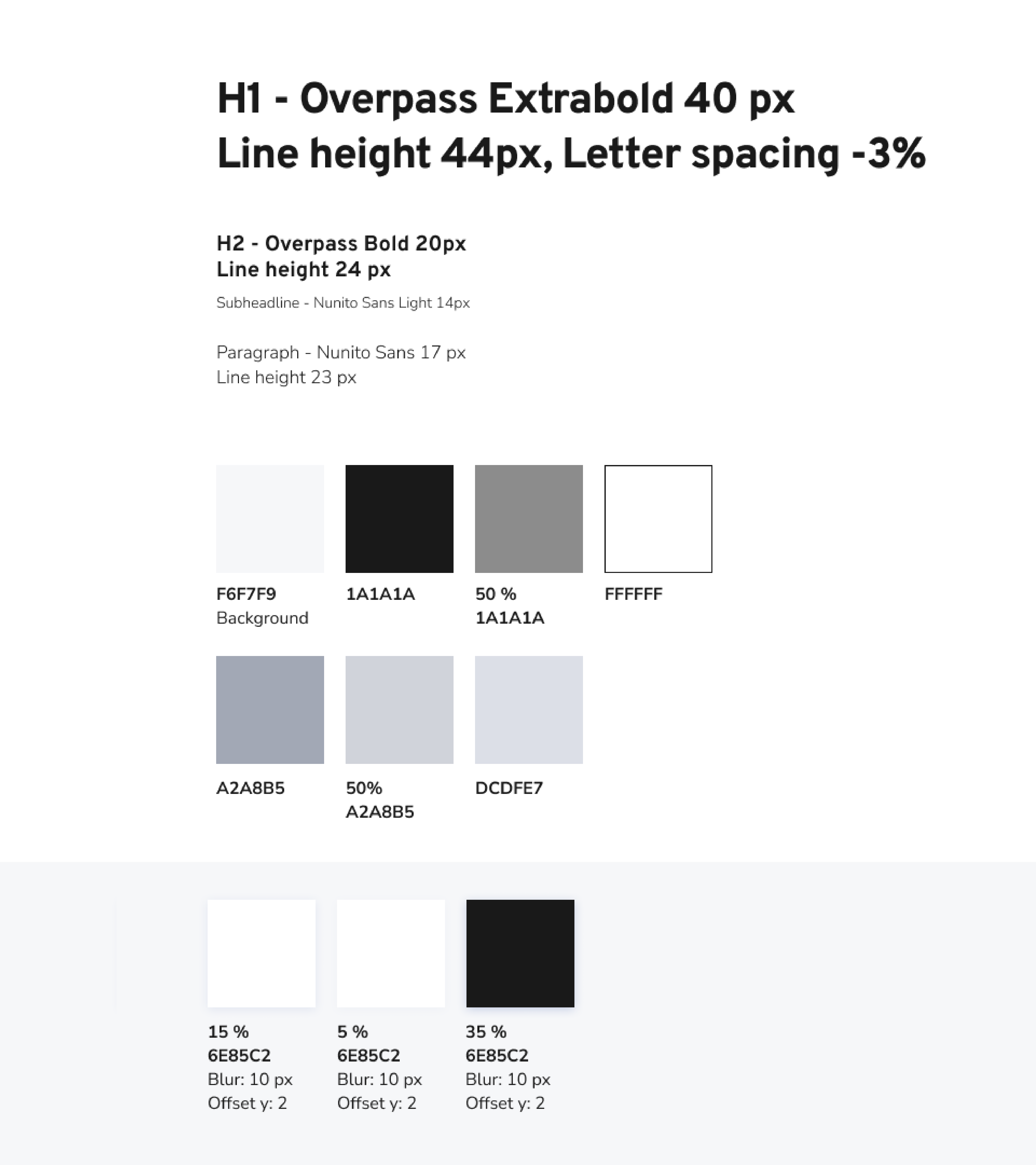
For the UI elements, the colours black, white and shades of gray with a slight blue undertone were used, since no colour could be derived as an interaction color with the colourful learning path. Another advantage is that the path remains in focus. Interactive elements stand out, with small exceptions like icons, through their shadows.
In addition to the design, the wording also influences whether it is fun to use. Therefore, particularly at the beginning, it is important not to use technical terms that might be off-putting. The titles of the chapters are worded to provoke curiosity, e.g. "the romantic model" instead of "a shared account“.
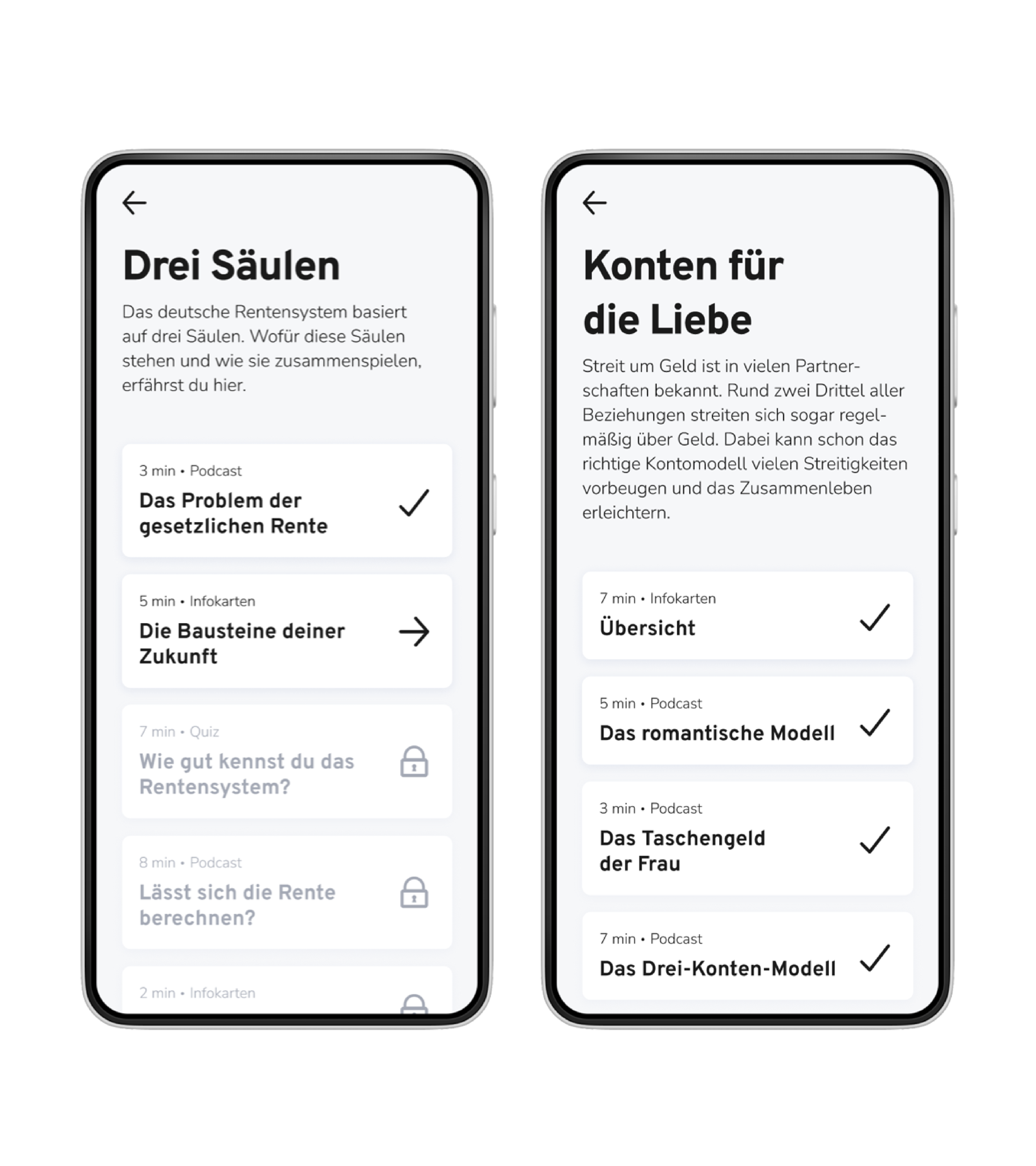
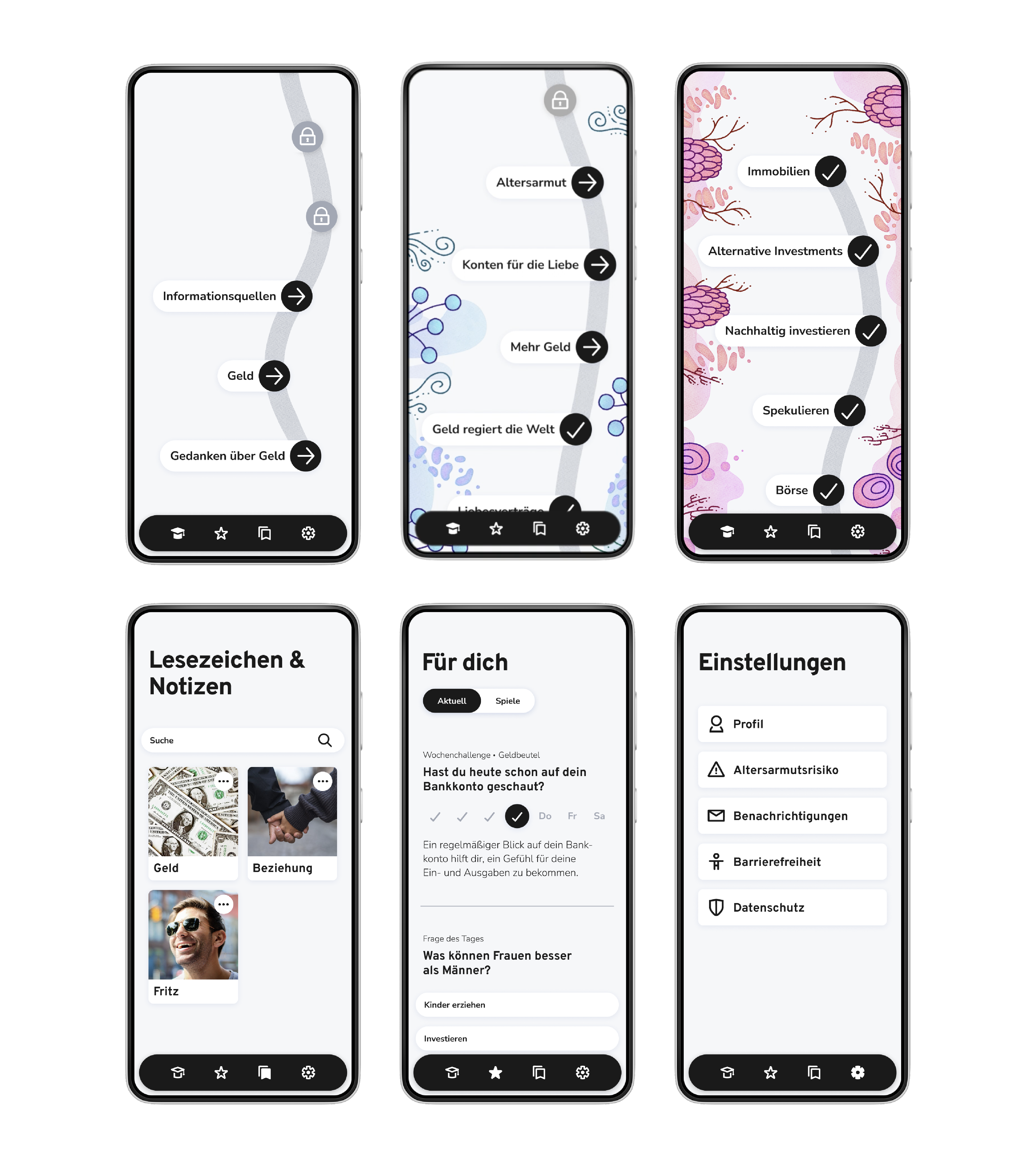
A financial learning app for women was conceptualized to help women earn more, invest confidently and get a good pension. The focus was on structure and to create a design that is motivating.
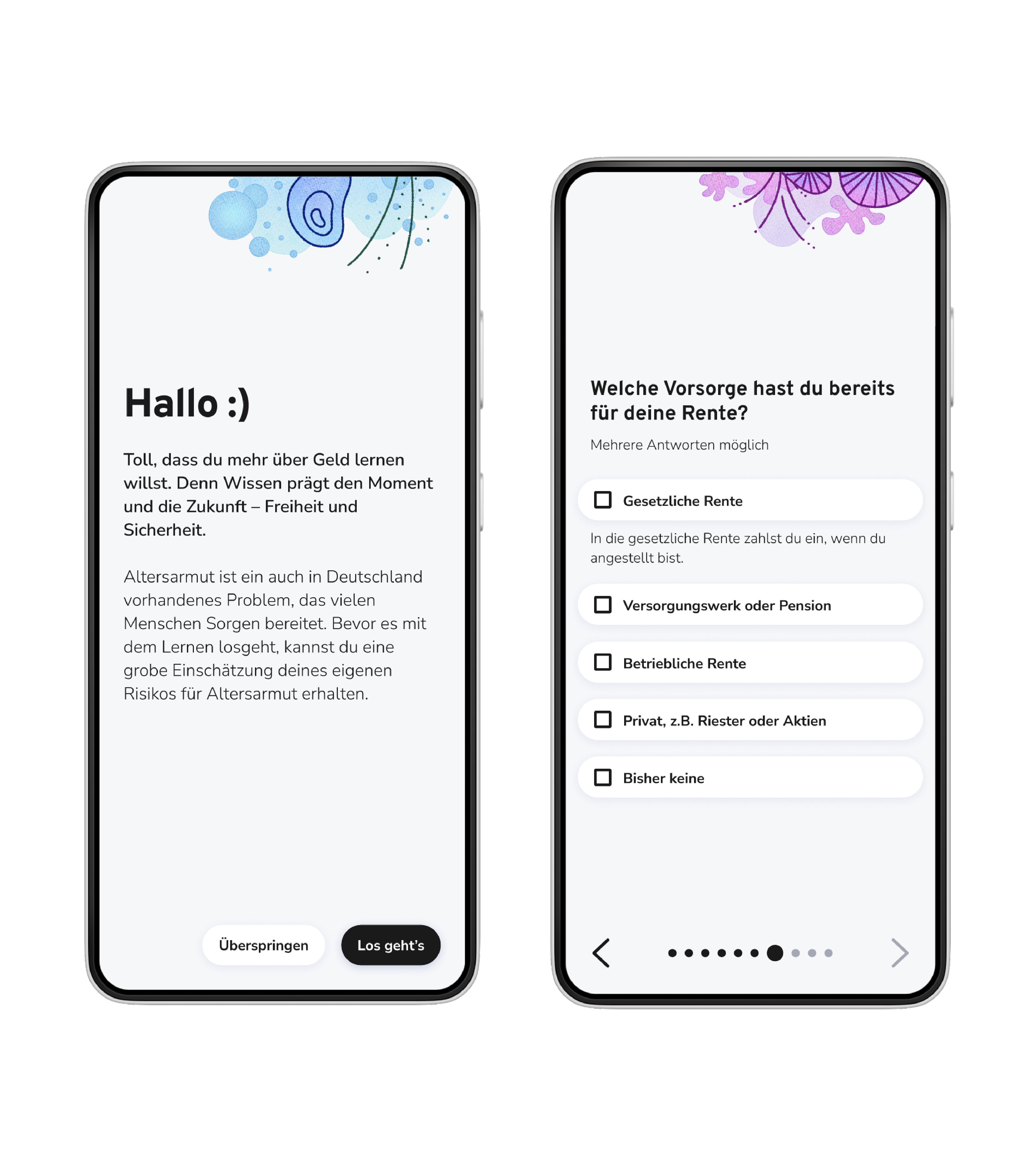
When the application is opened for the first time, there is the possibility of an estimation for poverty in retirement. This serves to highlight the problem and provide motivation to use the application.

The various sub-topics are divided into lessons, which are divided into micro-learning units. These offer users more flexibility and focus. The learning units are presented via different media, e.g. podcasts or information cards. This variety offers different perspectives.
In this bachelor's thesis, I was able to apply all that I learned over the past few years and refine individual skills. The most important issue being the ability to manage a project and make decisions, as we acted with complete autonomy. We were also able to take the time to delve deeper into the subject matter. For example, we looked very closely at finances and poverty in retirement. The biggest added value for me is what I learned about designing learning apps, e.g. extrinsic motivation and how valuable white space is.